Guides•10 min read•
How to Create a Productivity Dashboard for Work and Study
Learn how to create a productivity dashboard in 6 steps, with ready-made setups for professionals, developers and students you can copy into your browser today.
Key Takeaways
- A good productivity dashboard starts with an audit of what you actually open every day, not with a list of cool widgets.
- Split the page into four zones (search, links, today, info) so your eyes always know where to look.
- Cap yourself at four to six widgets and group links into a few named tables instead of one long bookmark bar.
- Professionals, developers and students need different setups, but the same six-step method works for all three.
- Set the dashboard as your new tab and spend five minutes a week pruning it, or it will slowly turn back into clutter.
You open a new tab to check one thing. Ten seconds later you are typing the same three URLs you typed yesterday, hunting for a note you wrote somewhere, and wondering which of the 40 open tabs has your task list in it. None of this is hard work, but it happens dozens of times a day, and it quietly eats your focus.
A productivity dashboard fixes that by putting the things you reach for most on a single page that appears every time you open a tab. The trick is building one that stays useful after the first week, instead of becoming another cluttered page you learn to ignore.
This guide walks through a practical six-step method, then gives you three complete example setups (for a professional, a developer and a student) that you can copy as-is or adapt.
What is a productivity dashboard, and why build one in your browser?
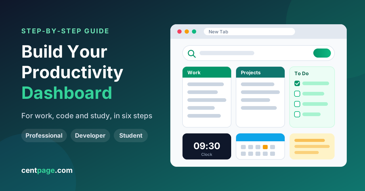
A productivity dashboard is a single page that gathers your most-used links, today's tasks, quick notes and a few pieces of glanceable information such as the time, your calendar or the weather. Think of it as the cockpit you look at before you start doing anything else.
Putting it in the browser matters because that is where most knowledge work now starts. If the dashboard is your new tab, you see it dozens of times a day without deciding to. If you are new to the idea, our explainer on how new tab pages evolved from blank screens into dashboards covers the background.
A good personal dashboard for work or study does three things:
- Cuts launch time. The sites you open daily are one click away, grouped logically.
- Holds today in view. Tasks and notes sit where you cannot forget them.
- Answers small questions instantly. Time zones, conversions and definitions without opening a new app.
How to create a productivity dashboard in 6 steps
The method below works whatever tool you use. The order matters: most people start by adding widgets, which is why their dashboards end up looking busy and feeling useless.
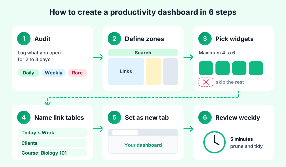
Step 1: Audit what you actually open every day
For two or three days, keep a rough list of every site and tool you open. Your browser history helps, but a quick tally on paper is more honest because it captures intent ("I needed a timer") and not just URLs.
At the end, sort the list into three groups:
- Daily: things you open most days (email, calendar, your main work app, course portal).
- Weekly: things you need regularly but not constantly (billing portal, analytics, a reference site).
- Rare: everything else. This does not belong on your dashboard.
Only the daily group earns a prime position. The weekly group goes lower down or into a "more" menu.
Step 2: Define four zones
Before choosing a single link or widget, decide on the layout. A zoned layout means your eyes learn where things live, so you stop scanning the whole page every time.
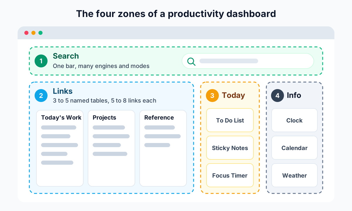
| Zone | Purpose | Typical contents |
|---|---|---|
| Search | Start any query from one place | One search bar that can switch engines or modes |
| Links | Launch daily sites in one click | Three to five named link tables |
| Today | Keep current work in view | To-do list, sticky notes, focus timer |
| Info | Answer small questions at a glance | Clock, calendar, weather, converter |
Search goes at the top because it is the most common action. Links take the widest area. Today and Info sit to the sides, where they are visible without competing with your links.
Step 3: Choose a maximum of four to six widgets
Widgets are the fun part, which is exactly why they need a hard limit. Every widget you add makes every other widget a little harder to see. Pick the ones that replace a tab you open repeatedly, and skip the ones that only look nice.
Use a simple test for each candidate: "Did I need this at least three times last week?" If the answer is no, leave it out. Our round-up of which new tab widgets are actually worth the space goes deeper on this trade-off.
Step 4: Group links into named tables
A single long row of bookmarks is hard to scan. Named tables of five to eight links each are much faster, because you look for the group first and then the link.
Good table names describe a job, not a website type:
- Today's Work instead of "Tools"
- Clients instead of "Sites"
- Course: Biology 101 instead of "School"
Put the table you use most in the top-left position, since that is where your eyes land first.
Step 5: Set it as your new tab page
A dashboard you have to remember to open is a dashboard you will stop opening. Make it your new tab page with an extension, or at least set it as your browser homepage. This single step is what turns a nice page into a habit.
Pro tip: If you use several browsers or computers, choose a dashboard that is tied to an account rather than to one browser profile. That way your layout follows you from the work laptop to the home desktop.
Step 6: Review it every week
Dashboards drift. New projects arrive, old ones end, and links pile up. A five-minute weekly review (covered in detail below) keeps the page honest.
Try it: CentPage gives you multi-engine search, drag-and-drop link tables and 50 widgets on one page. Open CentPage in your browser to sketch your zones, or add the CentPage extension for Chrome / Firefox so it opens on every new tab.
Example productivity dashboard setups you can copy
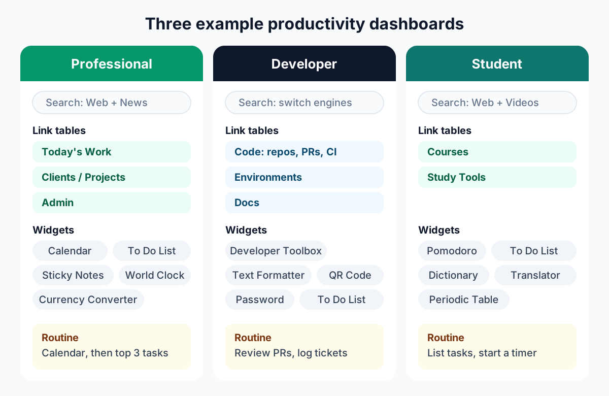
The method is the same for everyone, but the result looks very different depending on your day. Below are three setups built from real CentPage widgets, each with a suggested daily routine. Use them as starting points and adjust after your audit.
Personal dashboard for work: the professional and knowledge worker setup
Knowledge workers juggle meetings, messages and several projects at once. Their dashboard should make the day's shape obvious and keep context switching cheap.
| Element | What to include |
|---|---|
| Search | Web search by default, News mode for quick industry checks |
| Link table 1: Today's Work | Email, team chat, project board, shared drive, video meetings |
| Link table 2: Clients or Projects | One link per active project workspace or client portal |
| Link table 3: Admin | HR portal, expense system, time tracking |
| Widgets | Calendar, To Do List, Sticky Notes, World Clock, Currency Converter |
The World Clock earns its spot if you work with colleagues in other time zones, and the Currency Converter matters if you deal with international invoices or travel. If you do neither, drop them and keep the page lighter.
Daily routine: open a tab first thing, check the Calendar, then write your top three tasks in the To Do List. Use Sticky Notes as a scratchpad during calls and clear it at the end of the day.
For people who work across several projects, tabs are often the real problem. Super Session Manager, a companion extension from the same team, lets you save and restore named tab sessions and tab groups, so you can park a whole project workspace and reopen it later instead of keeping 30 tabs alive "just in case".
Developer dashboard in the browser
Developers open a predictable set of tools all day: repos, CI, docs, staging environments, and a long tail of small utilities for formatting, encoding and converting. A developer dashboard should make that long tail disappear.
| Element | What to include |
|---|---|
| Search | Web search, with a quick switch to another engine when results are thin |
| Link table 1: Code | Repository host, pull requests, CI pipeline, issue tracker |
| Link table 2: Environments | Local dev URL, staging, production, logs and monitoring |
| Link table 3: Docs | Language docs, framework docs, internal wiki, API reference |
| Widgets | Developer Toolbox, Text Formatter, QR & Barcode Generator, Password Generator, To Do List |
The Developer Toolbox covers small jobs like base conversion and markdown preview, and the Text Formatter handles case changes and cleanup without pasting snippets into random websites. The QR generator is handy for opening a local build on your phone, and the Password Generator is useful for test accounts.
For deeper page work, the same team makes WebDeveloperTools.dev, a Chrome extension with 500+ tools to inspect, outline, edit and audit any web page. It pairs well with a dashboard: the dashboard launches your work, and the extension handles in-page debugging.
Daily routine: start with the Code table to review open pull requests, note today's tickets in the To Do List, and keep the Environments table as your jumping-off point for testing.
Study dashboard for students
Students need fewer links and more focus. The ideal study dashboard makes starting a session effortless and keeps reference tools one click away, so a quick lookup never turns into a social media detour.
| Element | What to include |
|---|---|
| Search | Web search plus Images and Videos modes for research |
| Link table 1: Courses | Learning management system, each course page, class schedule |
| Link table 2: Study Tools | Library portal, citation tool, online notes, shared study group folder |
| Widgets | Pomodoro Timer, To Do List, Dictionary, Language Translator, Word of the Day |
| Subject extras | Periodic Table for chemistry, Unit Converter for physics |
The Pomodoro Timer is the anchor of this setup: 25 minutes of focus, a short break, repeat. The Interactive Periodic Table and Dictionary save constant tab-hopping during problem sets and essays, and Word of the Day is a small, low-effort vocabulary habit.
Lecture recordings and tutorial videos are a big time sink. SummaryTube, another extension from the same team, can summarize YouTube videos with AI right on the video page, which helps you decide which parts to watch closely and review key points before an exam.
Daily routine: open a tab, list the day's assignments in the To Do List, start a Pomodoro, and only open the Courses table once the timer is running.
How to build your dashboard in CentPage
Here is how the method translates into CentPage specifically. The whole process takes about 15 minutes. If you want the full feature tour first, see our complete CentPage overview.
- Open your dashboard. Go to centpage.com/homepage to try it immediately, or create a free account so your layout is saved and follows you across browsers and devices.
- Set up search. The search bar at the top lets you search Google, Bing, Yahoo and other engines from one place, with Web, Images, Videos and News modes. That is your Search zone done.
- Enter Edit Mode. Click "Enter Edit Mode". You can now drag and drop to reorder categories and the links inside them. Move the curated categories you actually use (for example Email, AI or Learn) to the top and push the rest down.
- Create custom tables. Add your own named link tables, like "Today's Work" or "Courses", using the names from Step 4 of the method. The free plan includes one custom table with eight links, and Premium raises that to five tables. Keep in mind that the first seven links of a category show on the homepage and the rest move into a "More" dropdown, which naturally rewards putting daily links first.
- Add widgets. Pick four to six from the 50 available (20 are free). The setups above use widgets like Calendar, To Do List, Sticky Notes, Pomodoro Timer, Clock & Timer, Currency Converter, Dictionary and Language Translator, all of which are free. Each widget also works as a standalone page, so you can test one before adding it.
- Install the extension. Add the CentPage extension for Chrome or Firefox so the dashboard replaces your new tab page. It asks for minimal permissions. On other browsers, set centpage.com as your homepage instead.
Pro tip: Build the dashboard on the device you use most, then sign in on your other machines. Because the layout is tied to your account, you only arrange it once.
A dashboard is one piece of a broader browser toolkit. If you want to see which other kinds of tools are worth centralizing, our guide to browser tools that cut down on context switching maps out ten categories.
How to maintain your dashboard: the weekly 5-minute review
The difference between a dashboard that lasts and one that gets abandoned is almost always maintenance. Put a recurring five-minute slot in your calendar, ideally at the end of the week, and run through this checklist:
- Prune links. Remove anything you did not click all week. If you are unsure, move it to the "More" area rather than deleting it.
- Promote winners. Anything you typed into the address bar more than twice this week deserves a spot in a link table.
- Question each widget. For every widget, ask whether it saved you a tab. If not, remove it and free up the space.
- Clear today. Archive finished to-dos and empty your sticky notes so Monday starts clean.
- Check the zones. If a table has grown past eight links, split it into two named tables.
Every few months, or at the start of a new semester or big project, repeat the audit from Step 1. Your work changes, and the dashboard should change with it.
Common mistakes to avoid
- Adding widgets because they are available. Fifty options is a menu, not a checklist.
- One giant "Links" table. If you cannot find a link in two seconds, the grouping is wrong.
- Leaving it as a bookmark. If it is not your new tab, you will forget it exists within a week.
- Mixing work and leisure in the top row. Keep entertainment links lower down or on a separate table so they do not ambush your focus.
Start with one zone today
You do not need a perfect dashboard on day one. Start with the zone that hurts most: if you lose time finding links, build two named tables; if you forget tasks, add a To Do List; if focus is the issue, start with a Pomodoro Timer. Add the next zone once the first becomes a habit.
When you are ready, open CentPage and lay out your four zones, then add the free extension for Chrome or Firefox so your dashboard is waiting in every new tab.
Frequently Asked Questions
What should a productivity dashboard include?
At minimum, a search bar, a few groups of the links you open daily, a to-do list or notes area for today, and one or two glanceable info widgets such as a clock or calendar. Anything beyond that should earn its place by saving you a trip to another tab or app.
How many widgets should I put on my dashboard?
Four to six is a practical limit for most people. Past that point the page starts to compete for attention instead of saving it, and you stop noticing the widgets that matter. If you want to add a new one, consider removing one you have not used in a week.
Is a browser dashboard better than a Notion or spreadsheet dashboard?
They solve different problems. A browser dashboard set as your new tab appears every time you open a tab, so it works best for quick launching, today's tasks and glanceable info. Document-style tools are better for long-form planning, databases and project documentation, and many people use both together.
Can students use a productivity dashboard for studying?
Yes, and it works well for study because it puts course portals, a focus timer and reference tools one tab away. A simple study dashboard with a Pomodoro timer, a task list for assignments and a dictionary or translator removes much of the friction that leads to procrastination.
How do I make my dashboard open every time I open a new tab?
The simplest way is a new tab extension that replaces the default new tab page with your dashboard. Alternatively, most browsers let you set a homepage URL in their settings so the dashboard loads when the browser starts or when you press the home button.
How often should I update my productivity dashboard?
A quick weekly review of about five minutes is enough for most people. Remove links you did not click, swap widgets that went unused, and move anything you opened often into a more prominent spot. A larger rethink every few months keeps it aligned with new projects or semesters.
Tags:#Productivity Dashboard#Personal Dashboard#Study Dashboard#Developer Dashboard#Browser Dashboard Setup#New Tab Page#Workspace Organization
More from the CentPage Blog
Browser Tips
What Is a New Tab Page? Turn Your Browser Into a Productivity Dashboard
What is a new tab page, how did it evolve, and how do you change it? Learn how to turn the most-seen page in your browser into a useful productivity dashboard.
10 min readRead →
Productivity
10 Best Browser Productivity Tools (No Download Needed)
The 10 best browser productivity tools, from quick notes and to-do lists to focus timers and converters, plus how one dashboard cuts context switching.
11 min readRead →